It’s been an extremely busy couple of weeks for me. I’ve a new series of works in the “pipeline” inspired by designs and colors found in psychedelic art from the sixties (and seventies). I’ve always loved the swirling lines, trippy designs with day-glo dazzling, vibrating colors that make your eyes go wonky.
The images I am working upon came from one small drawing that I’ve manipulated ad nauseum like I always manage to do. I have decided upon a total of three patterns (1966, 1967 and 1968) that will comprise a suite of large paintings. A variety of other designs will be used for assorted drawings and prints.
I began this series with a 2-color laser-cut relief print (1966) to see if I liked the concept well enough to go for it. Turns out, I liked it just fine. 1966 will also be done in a variety of relief print iterations. One I am excited about is a tie-dye version. It’s on the schedule for next week at Santo Press and I can’t wait to see the edition. We’ve only done a couple of proofs and are still tweaking it, but it will look very much as the image below shows.
The first in the series of what I hope will be 3 large paintings, 1967 provided me a very steep learning curve and a good reminder of the wisdom behind the saying use it or loose it. Quite frankly, I haven’t painted in a very long time–and it took me a while to get my painting hand back in shape. After spending over 40 hours painting, I think I’m just about back to my desired skill level.
The next problem I had to sort out was which painting medium to use. I wanted to get the flat, matte paint surface of gouache (I love gouache), but didn’t want to deal with the various problems associated with using that medium on a large scale painting. After a bit of research I discovered a product made by Turner (a Japanese company) called Acryl Gouache. It is a water soluble, acrylic-based paint that handles like gouache and looks exactly like gouache when dry, but allows you to overpaint areas without disturbing the bottom layer of paint–which is a huge benefit over gouache. Plus, once it dries it is impervious to water–yet another benefit. It took me a few trial runs, but I got the hang of it and think it has given me exactly the look and finish I wanted.
Here are a few images of the newest work in my studio.
Travel back to the sixties with me!
 1966, 2-color multi-block laser-cut relief print, edition of 50, 8″ x 7″ on paper 11″ x 9.5″, 2017
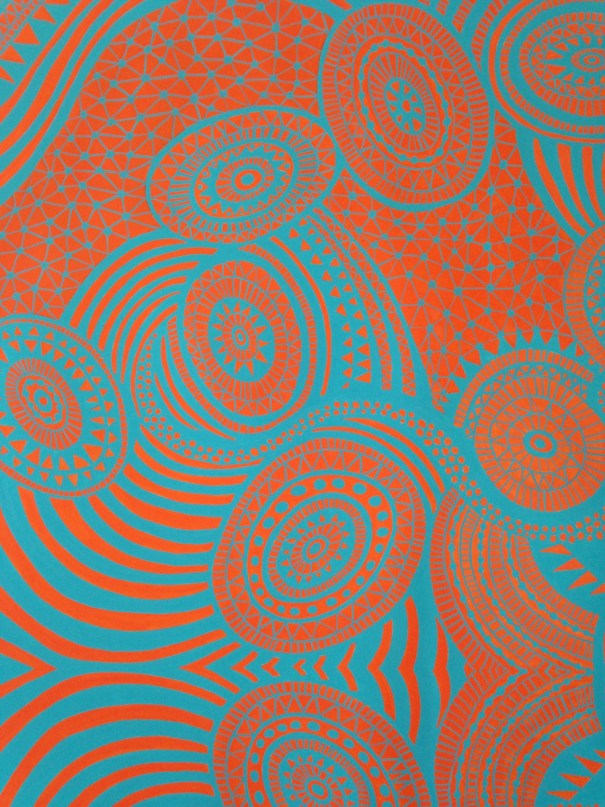
 1967, acrylic gouache on paper, 32″ x 32″, 2017
 1967 (detail), acrylic gouache on paper, 32″ x 32″, 2017
 1966, archival digital print with laser-cut linoleum block, edition of 10, 8″ x 7″ on paper 13″ x 11″ 2017
Read more →

 1965, 1966, 1967; acrylic gouache on paper; image size 32 x 32 inches.

 Web Pathway; 2017, reduction linocut; 10″ x 8″ on 14″ x 11″ paper; variable edition of 30; published by SantoPress.
 A close look at the Shibori-esque wax paper filled with delicate crinkles and patterns.
 Placing the Shibori-esque wax paper on inked plate for 3rd color off-set.
 Brent using a roller to offset print the 3rd color. The hand pressure exerted by the brayer causes the crinkled wax paper to push into the ink, leaving it’s crazed, lace-like markings in the ink.
 The wax paper is removed, taking away a layer of ink–and leaving the crinkled impression behind. The 2-color print is then run through the press transferring the Shibori-esque, crinkled texture of the wax paper as the third and final color.
 Kaleidoscope A; 36″ x 48″, archival inkjet print; 2016.
 Kaleidoscope B; 36″ x 48″, archival inkjet print; 2016.
 Kaleidoscope C; 36″ x 48″, archival inkjet print; 2016.
 Kaleidoscope D; 36″ x 48″, archival inkjet print; 2016.


