The Sixties Series–1965
A sneak peek at the third (and quite possibly the final) large painting in The Sixties series. The painting is 32″ x 32″ on Stonehenge paper. The colors are intense and vibrating red/orange and purple/blue. It’s quite difficult to get a true color reading on the camera’s sensor when photographing the painting because these colors are so vibrant and they really do vibrate. They did, however, show up very true in these small color chips I made while mixing the colors.

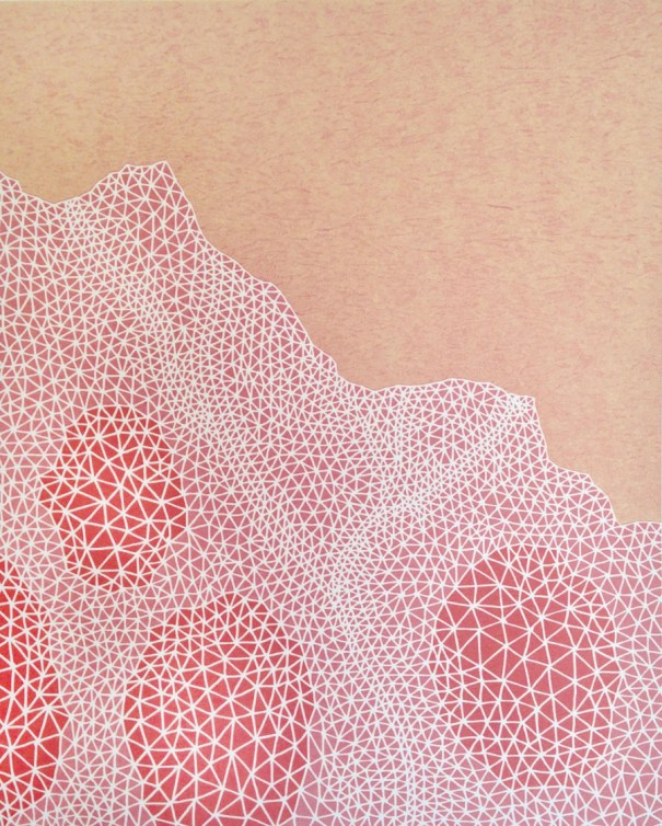
This first image is of the completed orange-red layer.

I am currently painting in all the detail on the orange after completely filling in the white areas with the purple-blue color. If all goes as planned there is probably another 7 or 8 hours until completion.
These are the small color studies I made of The Sixties series paintings. It’s always a good idea to see how the colors work “small scale” prior to painting them in such a large format. I have found it is easier to tweak colors at this stage prior to beginning a 40-hour painting only to discover the colors don’t work.

You can view the other two completed paintings (1966 and 1967) from this series here and then there’s an earlier blog post about my Sixties series of paintings and prints here.
Read more →

 Web Pathway; 2017, reduction linocut; 10″ x 8″ on 14″ x 11″ paper; variable edition of 30; published by SantoPress.
 A close look at the Shibori-esque wax paper filled with delicate crinkles and patterns.
 Placing the Shibori-esque wax paper on inked plate for 3rd color off-set.
 Brent using a roller to offset print the 3rd color. The hand pressure exerted by the brayer causes the crinkled wax paper to push into the ink, leaving it’s crazed, lace-like markings in the ink.
 The wax paper is removed, taking away a layer of ink–and leaving the crinkled impression behind. The 2-color print is then run through the press transferring the Shibori-esque, crinkled texture of the wax paper as the third and final color.